
Elevating online presence to bring the best sushi to your table

Sushi Club is an Asian restaurant that serves delicious sushi with visually appealing pieces of fresh fish and unique creations. The project aimed to create a user-friendly website that provides essential information about the restaurant showcases the menu offerings, and encourages online deliveries or visits to the physical location.
My work included the delivery of a new visual identity and designing a website that communicates the unique experience of the Sushi Club in an intuitive and easy-to-use navigation highlighting the wide variety of sushi offerings.
Role:
Visual Identity
Market Research
UX UI Design
Content Strategy
2020

Visual identity
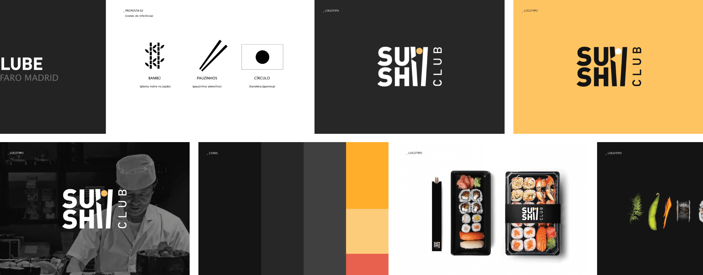
When choosing sushi, imagery is crucial for any sushi lover. So, the logo should evoke the elegance and ambience of the Sushi Club. The word "Sushi" was designed by using two sticks at the end with the letter "i" which resembles a sushi roll.
Defining website content and structure
The website's content prioritizes important information with five main pages: the homepage, menu page, events page, club concept page, shopping cart and checkout pages.
Considering that the homepage multiplies the entire business value of any website, I have organized it accordingly giving customers an overall idea of what Sushi Club offers. Also highlighted are clear starting points for the main tasks to do here, such as choosing the type of service, going to the menu, or seeing the new dishes.
Getting delivery service in non-covered areas
It is important to select the type of service at the beginning because it allows customers to check if their delivery area is covered or not beforehand.
To make this process easier, the option to choose the type of service has been placed on key pages of the website, including the homepage, menu page, shopping cart, and the beginning of the checkout.
At the moment, the delivery service is limited to the city centre only. To identify which delivery areas make sense to cover in the future, customers living in the suburbs can vote by sending us their zip codes.
The areas with the highest number of votes will be tested for delivery service. This way, Sushi Club can expand the delivery service while ensuring that potential customers are not left out.


Intuitive ordering
Navigation between item categories is done on the side of the screen on the desktop. Users can easily discover the items they need.
The menu categorizes sushi offerings based on their type, such as nigiri, sashimi, rolls, etc. Each item comes with a name and price, as well as access to a page with more details and suggestions for other items.
Also added filters to help customers select items based on dietary preferences such as gluten-free, vegan, etc. Making it easier for them to find what they're looking for and add it to their order.
These filters open on a full page on mobile considering the small size of the screen, focusing the user on selecting the items they want.

Unlocking exclusive offers
To increase the number of website subscriptions and emphasize the exclusivity of the “Club” concept, customers will find special item cards that are only available to those who are registered.
These cards have a lock icon, and when customers click on one of these cards, they will be prompted with a modal asking them to register to have access to these exclusive items.

Adopting clear shopping cart optimization
The human-centred design allows users to include all the relevant data required in the shopping cart for a smooth shopping process and for the customer to know exactly which items they are purchasing, their quantity and other relevant information for clear and easy order.
The shopping cart is a side drawer on the desktop and a full-screen option on mobile. Customers can add or remove items, view the total payment amount, change the type of service, and proceed to checkout.
On mobile, the layout uses the same components and functions in the same way as the desktop version, but in full screen.

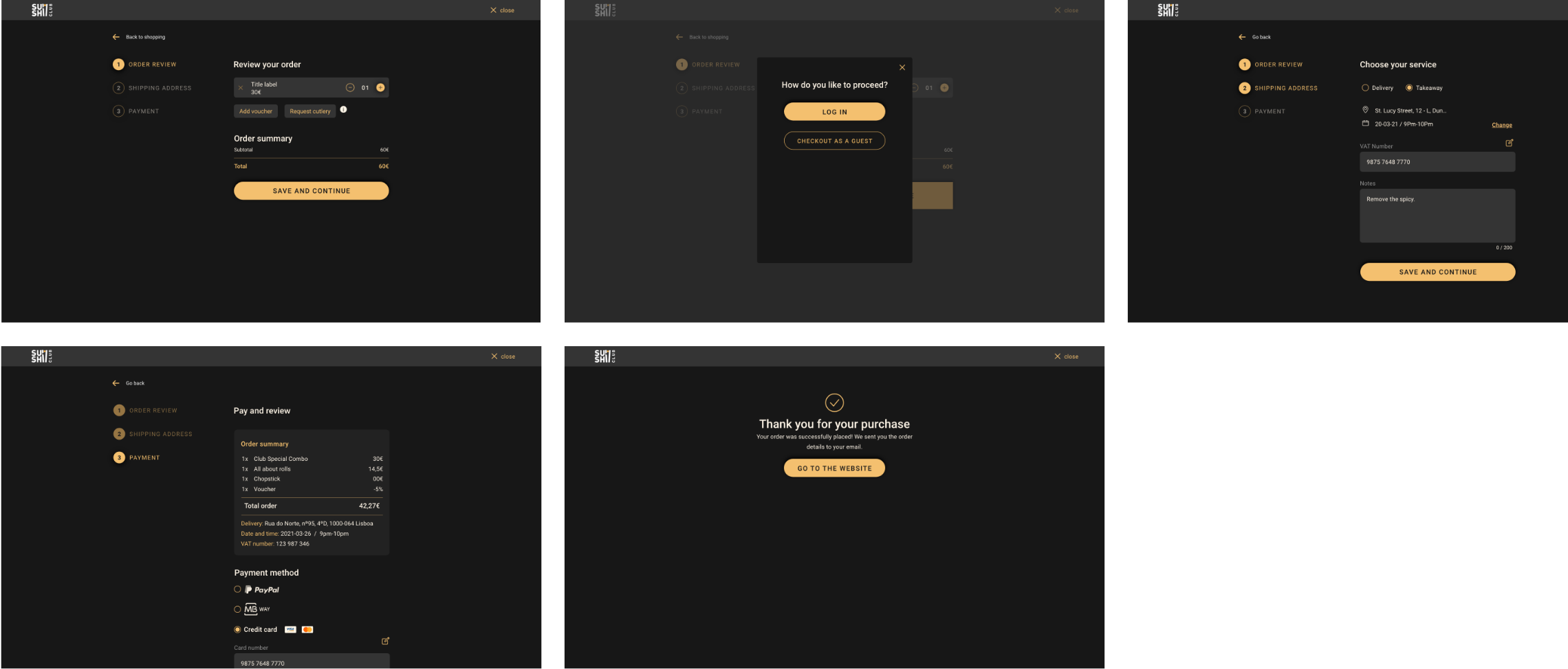
Streamlining the process and confirming the order
Proceeding as a guest or logging in, customers will still be able to modify their order or return to shopping at the beginning of the checkout process.
The checkout process has three main steps, visible on a progress indicator to help customers know where they are.
1. Order Review: check the order summary and add additional items such as vouchers, cutlery, etc.
2. Identify: log in or checkout as a guest.
3. Shipping Information: confirm customer contact details (address, phone number, name, and email), service, VAT, or add any notes.
4. Payment; select a shipping method and pay.
5. Confirmation: customers will see a screen confirming that their purchase was successful. An email with the order summary and payment details will be also sent to them.
Directing the UI
The visual design captures the essence of Japanese cuisine and the dining experience at Sushi Club. Colors and images of sushi dishes showcase the restaurant's offerings and atmosphere.
The dark color palette conveys the elegance of oriental culture. To ensure good contrast with the background, I used dark gray tones and avoided using strong contrasts like pure white surfaces and yellow to highlight buttons and text links.
For icons and typography, I used medium line thickness in dark mode, as thin lines can be hard to see. Very strong lines blend too easily and create a large blur of colors.
To create a shadow effect on the dark background, I adjusted the surface brightness. Surfaces closer to the user (top) are brighter than those further away. This makes the stacking order easy to understand.
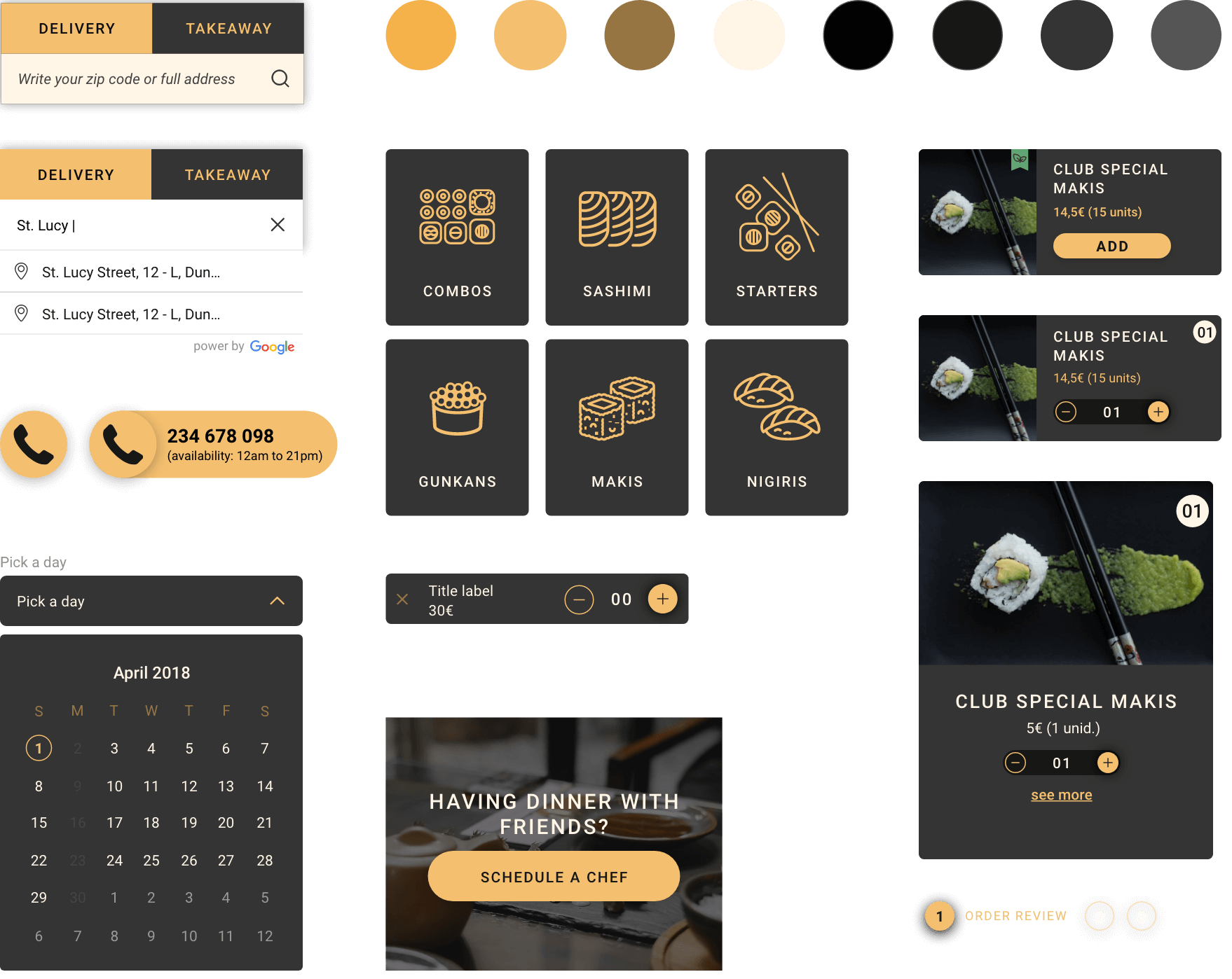
Card anatomy
A card-based user interface simplifies menu item organization. Each card summarizes the information necessary to select a menu item and add it to the cart.

Key takeaways
Understanding website usage with different needs helped me develop a clear view of user expectations. However, nothing compares to usability testing inputs, as they are a very effective way of showing different scenarios that are difficult to predict, as well as encouraging improvements.
Due to project constraints, obtaining user feedback was limited, hindering confidence in the site's ability to meet user needs.